COLLI DEI LONGOBARDI
BRANDING / VISUAL IDENTITY
Colli Dei Longobardi
A contemporary visual identity created to represent the cultural and gastronomic route of Strada del Vino e dei Sapori: Colli dei Longobardi, bringing together heritage, territory, and local tradition into a cohesive and memorable brand system.
TOOLS // Adobe Illustrator, Adobe Indesign
INFLUENCE // Lombard Heritage, Italian culture
MOOD // Rooted, Symbolic, Contemporary
Lorem ipsum dolor sit amet, consectetur adipiscing elit. Pellentesque ut metus et diam gravida tincidunt.
Cras a dignissim tortor. Vivamus gravida at neque in porta. Praesent quis rhoncus odio. Aliquam lacus lacus, sodales nec magna vitae, ullamcorper euismod ipsum. Curabitur sit amet auctor turpis, at luctus tortor. Orci varius natoque penatibus et magnis dis parturient montes, nascetur ridiculus mus. Ut vehicula risus vitae blandit ornare. Mauris quis malesuada lectus. Aliquam erat volutpat. Integer tortor orci, egestas sit amet fringilla a, commodo non nulla. Nunc sollicitudin condimentum erat vitae hendrerit.
The brief
The project began with a clear objective: to create a new visual identity for Strada del Vino e dei Sapori: Colli dei Longobardi, a food and wine route connecting wineries, local producers, historical landmarks, and cultural experiences throughout the Brescia hills.
The identity needed to communicate much more than tourism. It had to represent an entire territory, bringing together its historical heritage, gastronomic tradition, and landscape within a single recognizable symbol. Alongside creating a contemporary logo, one of the key requirements was preserving the organization's complete denomination while integrating the Gallo di Ramperto, the historic rooster that has long served as its identifying emblem.
The challenge became finding a balance between symbolism and clarity. The mark needed to feel rooted in history while remaining simple enough to work across signage, printed material, editorial publications, merchandising, and digital communication.
The symbol
The process started with research into the cultural identity of the region. The intention was to build the identity around something uniquely connected to the Longobard heritage.
The stylization of the Gallo di Ramperto drew inspiration from the ornamental characteristics of Longobard jewelry, whose flowing curves and rounded geometric forms offered a distinctive aesthetic language. These references allowed the logo to communicate history without relying on literal historical illustration.
The identity

The final logo is built around a system of concentric geometric forms. This decision wasn't purely aesthetic, it creates multiple layers of meaning within a single mark.
The circular construction echoes the rolling hills that define the Colli dei Longobardi landscape while simultaneously reflecting the repetitive curved motifs found in Longobard decorative art. These shared geometries became the visual bridge between territory and heritage.
The rooster itself was simplified to its essential silhouette, ensuring immediate recognition while improving versatility across different scales and applications. Removing unnecessary details allowed the mark to remain legible whether reproduced on stationery, signage, promotional material, or digital platforms.
Typography was intentionally restrained. Because the organization's name is long, clarity became a priority. A contemporary typeface provides contrast with the expressive symbol, creating a balanced identity where neither element competes for attention.
The colour palette takes inspiration from the territory itself. Deep wine reds reference the region's viticulture, while warm neutral tones reinforce the identity's connection to history, craftsmanship, and local culture without feeling nostalgic.
Throughout the project, every design decision returned to one fundamental question:
How can a single symbol represent both a place and the history that shaped it?
Rather than illustrating vineyards, castles, or landscapes directly, the identity communicates them through abstraction. The concentric geometry recalls the morphology of the hills, the stylized rooster preserves one of Brescia's strongest cultural icons, and the ornamental construction pays homage to Longobard craftsmanship.
The result is an identity that feels contemporary while remaining deeply connected to its origins.
More Than a Logo
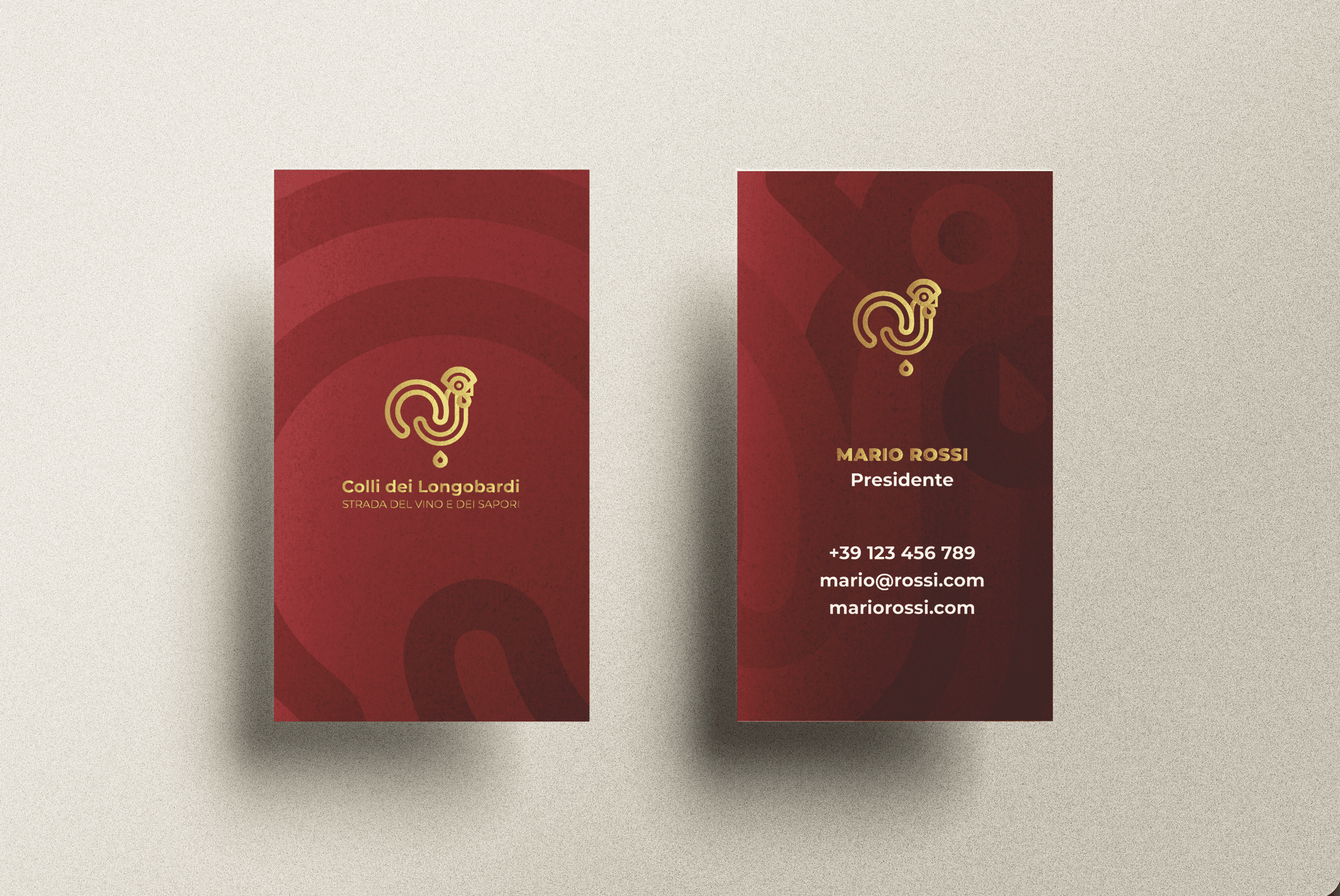
The project extends beyond the logo itself. The geometric language established by the symbol naturally generates supporting graphic elements, patterns, and compositions that create consistency across every application—from stationery and editorial material to signage and promotional assets.
By treating the identity as a flexible visual system instead of an isolated mark, the brand gains longevity and adaptability while maintaining a strong connection to the cultural values it represents.
02 // SYMBOLIC
Every element carries meaning. From the concentric geometry to the stylized rooster, the logo translates cultural references into a contemporary visual language rather than relying on literal representation.
01 // ROOTED
The identity is deeply connected to the Brescia territory, drawing inspiration from its landscape, traditions, and the historical symbolism of the Gallo di Ramperto.
03 // CONTEMPORARY
Historical influences are reinterpreted through clean forms, balanced typography, and a minimal graphic system, allowing the identity to feel relevant while respecting its heritage.
A Symbol of Place, Shaped by History.
From historical research to geometric construction, the identity for Colli dei Longobardi translates the heritage of Brescia into a contemporary visual language, one that celebrates its past while confidently representing its future.
BRANDING / VISUAL IDENTITY
Colli Dei Longobardi
Colli Dei Longobardi
A contemporary visual identity created to represent the cultural and gastronomic route of Strada del Vino e dei Sapori: Colli dei Longobardi, bringing together heritage, territory, and local tradition into a cohesive and memorable brand system.
TOOLS // Adobe Illustrator, Adobe Indesign
INFLUENCE // Lombard Heritage, Italian culture
MOOD // Rooted, Symbolic, Contemporary
01 // ROOTED
The identity is deeply connected to the Brescia territory, drawing inspiration from its landscape, traditions, and the historical symbolism of the Gallo di Ramperto.
The identity is deeply connected to the Brescia territory, drawing inspiration from its landscape, traditions, and the historical symbolism of the Gallo di Ramperto.
02 // SYMBOLIC
Every element carries meaning. From the concentric geometry to the stylized rooster, the logo translates cultural references into a contemporary visual language rather than relying on literal representation.
Every element carries meaning. From the concentric geometry to the stylized rooster, the logo translates cultural references into a contemporary visual language rather than relying on literal representation.
03 // CONTEMPORARY
Historical influences are reinterpreted through clean forms, balanced typography, and a minimal graphic system, allowing the identity to feel relevant while respecting its heritage.
Historical influences are reinterpreted through clean forms, balanced typography, and a minimal graphic system, allowing the identity to feel relevant while respecting its heritage.




The brief
The project began with a clear objective: to create a new visual identity for Strada del Vino e dei Sapori: Colli dei Longobardi, a food and wine route connecting wineries, local producers, historical landmarks, and cultural experiences throughout the Brescia hills.
The identity needed to communicate much more than tourism. It had to represent an entire territory, bringing together its historical heritage, gastronomic tradition, and landscape within a single recognizable symbol. Alongside creating a contemporary logo, one of the key requirements was preserving the organization's complete denomination while integrating the Gallo di Ramperto, the historic rooster that has long served as its identifying emblem.
The challenge became finding a balance between symbolism and clarity. The mark needed to feel rooted in history while remaining simple enough to work across signage, printed material, editorial publications, merchandising, and digital communication.
The symbol
The process started with research into the cultural identity of the region. The intention was to build the identity around something uniquely connected to the Longobard heritage.
The stylization of the Gallo di Ramperto drew inspiration from the ornamental characteristics of Longobard jewelry, whose flowing curves and rounded geometric forms offered a distinctive aesthetic language. These references allowed the logo to communicate history without relying on literal historical illustration.
The identity
The final logo is built around a system of concentric geometric forms. This decision wasn't purely aesthetic, it creates multiple layers of meaning within a single mark.
The circular construction echoes the rolling hills that define the Colli dei Longobardi landscape while simultaneously reflecting the repetitive curved motifs found in Longobard decorative art. These shared geometries became the visual bridge between territory and heritage.
The rooster itself was simplified to its essential silhouette, ensuring immediate recognition while improving versatility across different scales and applications. Removing unnecessary details allowed the mark to remain legible whether reproduced on stationery, signage, promotional material, or digital platforms.
Typography was intentionally restrained. Because the organization's name is long, clarity became a priority. A contemporary typeface provides contrast with the expressive symbol, creating a balanced identity where neither element competes for attention.
The colour palette takes inspiration from the territory itself. Deep wine reds reference the region's viticulture, while warm neutral tones reinforce the identity's connection to history, craftsmanship, and local culture without feeling nostalgic.
Throughout the project, every design decision returned to one fundamental question:
How can a single symbol represent both a place and the history that shaped it?
Rather than illustrating vineyards, castles, or landscapes directly, the identity communicates them through abstraction. The concentric geometry recalls the morphology of the hills, the stylized rooster preserves one of Brescia's strongest cultural icons, and the ornamental construction pays homage to Longobard craftsmanship.
The result is an identity that feels contemporary while remaining deeply connected to its origins.
More than a logo
The project extends beyond the logo itself. The geometric language established by the symbol naturally generates supporting graphic elements, patterns, and compositions that create consistency across every application—from stationery and editorial material to signage and promotional assets.
By treating the identity as a flexible visual system instead of an isolated mark, the brand gains longevity and adaptability while maintaining a strong connection to the cultural values it represents.
The brief
The project began with a clear objective: to create a new visual identity for Strada del Vino e dei Sapori: Colli dei Longobardi, a food and wine route connecting wineries, local producers, historical landmarks, and cultural experiences throughout the Brescia hills.
The identity needed to communicate much more than tourism. It had to represent an entire territory, bringing together its historical heritage, gastronomic tradition, and landscape within a single recognizable symbol. Alongside creating a contemporary logo, one of the key requirements was preserving the organization's complete denomination while integrating the Gallo di Ramperto, the historic rooster that has long served as its identifying emblem.
The challenge became finding a balance between symbolism and clarity. The mark needed to feel rooted in history while remaining simple enough to work across signage, printed material, editorial publications, merchandising, and digital communication.
The symbol
The process started with research into the cultural identity of the region. The intention was to build the identity around something uniquely connected to the Longobard heritage.
The stylization of the Gallo di Ramperto drew inspiration from the ornamental characteristics of Longobard jewelry, whose flowing curves and rounded geometric forms offered a distinctive aesthetic language. These references allowed the logo to communicate history without relying on literal historical illustration.
The identity
The final logo is built around a system of concentric geometric forms. This decision wasn't purely aesthetic, it creates multiple layers of meaning within a single mark.
The circular construction echoes the rolling hills that define the Colli dei Longobardi landscape while simultaneously reflecting the repetitive curved motifs found in Longobard decorative art. These shared geometries became the visual bridge between territory and heritage.
The rooster itself was simplified to its essential silhouette, ensuring immediate recognition while improving versatility across different scales and applications. Removing unnecessary details allowed the mark to remain legible whether reproduced on stationery, signage, promotional material, or digital platforms.
Typography was intentionally restrained. Because the organization's name is long, clarity became a priority. A contemporary typeface provides contrast with the expressive symbol, creating a balanced identity where neither element competes for attention.
The colour palette takes inspiration from the territory itself. Deep wine reds reference the region's viticulture, while warm neutral tones reinforce the identity's connection to history, craftsmanship, and local culture without feeling nostalgic.
Throughout the project, every design decision returned to one fundamental question:
How can a single symbol represent both a place and the history that shaped it?
Rather than illustrating vineyards, castles, or landscapes directly, the identity communicates them through abstraction. The concentric geometry recalls the morphology of the hills, the stylized rooster preserves one of Brescia's strongest cultural icons, and the ornamental construction pays homage to Longobard craftsmanship.
The result is an identity that feels contemporary while remaining deeply connected to its origins.
More Than a Logo
The project extends beyond the logo itself. The geometric language established by the symbol naturally generates supporting graphic elements, patterns, and compositions that create consistency across every application—from stationery and editorial material to signage and promotional assets.
By treating the identity as a flexible visual system instead of an isolated mark, the brand gains longevity and adaptability while maintaining a strong connection to the cultural values it represents.
A Symbol of Place, Shaped by History.
A Symbol of Place, Shaped by History.
From historical research to geometric construction, the identity for Colli dei Longobardi translates the heritage of Brescia into a contemporary visual language, one that celebrates its past while confidently representing its future.