BROOKLYN
TYPE DESIGN / TYPEFACE
Brooklyn
A typeface born from a simple question:
can letterforms carry the memory of a place?
TOOLS // Adobe Illustrator, FontLab
INFLUENCE // Brooklyn storefronts, hand-painted signage
MOOD // Character, warmth, timeless
Lorem ipsum dolor sit amet, consectetur adipiscing elit. Pellentesque ut metus et diam gravida tincidunt.
Cras a dignissim tortor. Vivamus gravida at neque in porta. Praesent quis rhoncus odio. Aliquam lacus lacus, sodales nec magna vitae, ullamcorper euismod ipsum. Curabitur sit amet auctor turpis, at luctus tortor. Orci varius natoque penatibus et magnis dis parturient montes, nascetur ridiculus mus. Ut vehicula risus vitae blandit ornare. Mauris quis malesuada lectus. Aliquam erat volutpat. Integer tortor orci, egestas sit amet fringilla a, commodo non nulla. Nunc sollicitudin condimentum erat vitae hendrerit.
Display-oriented serifs were designed to be extremely bold, intended to grab the reader's attention on a poster.
Brooklyn follows that same logic: a typeface that doesn't ask, It states.
This is not a font that wants to be read in paragraphs. It wants to be felt at a distance, set large, given space to breathe. Put it in body text and it suffocates. Put it on a billboard and it owns the wall.
I didn't design Brooklyn at a desk. I designed it on foot. All over Brooklyn, local signage tells you something that a corporate font never could: it is representative of a group of people, of a neighborhood, not just a business that could be anywhere in the world. Every stroke on every storefront had been made by a hand, not a machine. Thick here, thinner there. Confident but imperfect.
It's not chaos. It's character. Everything here is big and bold. Everything wants your attention. Brooklyn doesn't do subtle. And neither does this typeface. Brooklyn is a type experiment that started as question: “what does a place feel like in letterform?” and ended as something that carries the answer in every curve. The serifs are the stoops. The weight is the brick. The roundness is the people.
The typeface
The charm of “Brooklyn” lies in its irregularities, which give it a dynamic and artisanal touch. The typeface’s bold weight enhances its assertiveness, making it an excellent choice for headlines, short and big copy or signs. Used in these contexts, “Brooklyn” creates a strong visual impact. Conversely, due to its weight, it may not be the most suitable option for dense and small texts. In long paragraphs or small type, irregularities may cause visual distractions and reducing overall readability.
02 // WARMTH
The roundness softens the impact, the curves invite you in. It's a big font with good intentions. Loud, but never mean.
01 // CHARACTER
No two letters feel factory-made. Every irregularity adds character, making the typeface feel alive.
03 // TIMELESS
Brooklyn doesn't feel young or old. Not vintage, not modern. It feels earned, like the result of something lived rather than studied.
Spread love,
it's the Brooklyn way!
From observation to letterform, Brooklyn turns the visual identity of a neighborhood into a bold display typeface.
TYPE DESIGN / TYPEFACE
Brooklyn
Brooklyn
A typeface born from a simple question:
can letterforms carry the memory of a place?
A typeface born from a simple question:
can letterforms carry the memory of a place?
TOOLS // Adobe Illustrator, FontLab
INFLUENCE // Brooklyn storefronts, hand-painted signage
MOOD // Character, warmth, timeless
01 // CHARACTER
01 // CHARACTER
No two letters feel factory-made. Every irregularity adds character, making the typeface feel alive.
No two letters feel factory-made. Every irregularity adds character, making the typeface feel alive.
02 // WARMTH
The roundness softens the impact, the curves invite you in. It's a big font with good intentions. Loud, but never mean.
The roundness softens the impact, the curves invite you in. It's a big font with good intentions. Loud, but never mean.
03 // TIMELESS
Brooklyn doesn't feel young or old. Not vintage, not modern. It feels earned, like the result of something lived rather than studied.
Brooklyn doesn't feel young or old. Not vintage, not modern. It feels earned, like the result of something lived rather than studied.


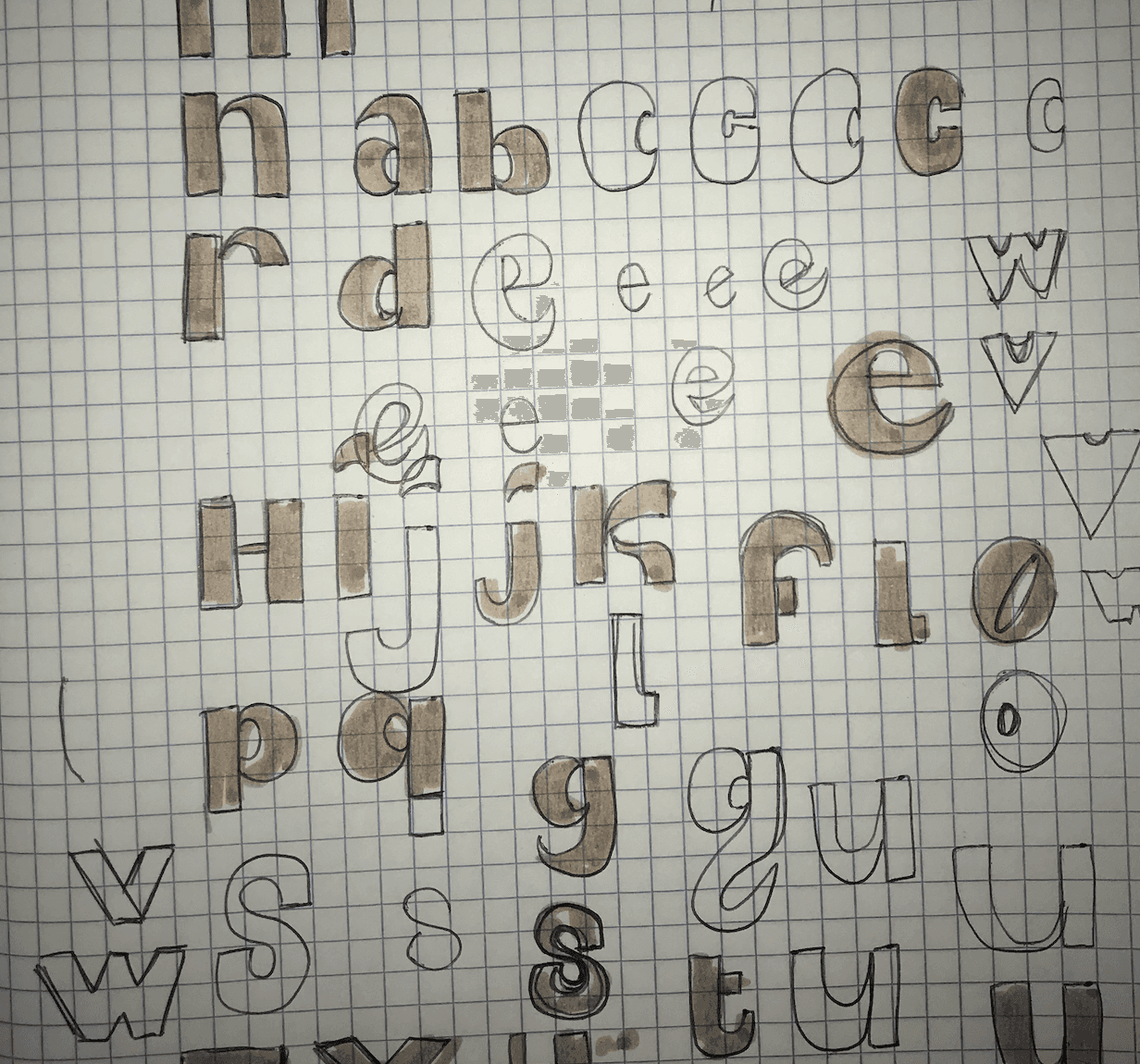


Display-oriented serifs were designed to be extremely bold, intended to grab the reader's attention on a poster.
Brooklyn follows that same logic: a typeface that doesn't ask, It states.
This is not a font that wants to be read in paragraphs. It wants to be felt at a distance, set large, given space to breathe. Put it in body text and it suffocates. Put it on a billboard and it owns the wall.
I didn't design Brooklyn at a desk. I designed it on foot. All over Brooklyn, local signage tells you something that a corporate font never could: it is representative of a group of people, of a neighborhood, not just a business that could be anywhere in the world. Every stroke on every storefront had been made by a hand, not a machine. Thick here, thinner there. Confident but imperfect.
It's not chaos. It's character. Everything here is big and bold. Everything wants your attention. Brooklyn doesn't do subtle. And neither does this typeface. Brooklyn is a type experiment that started as question: “what does a place feel like in letterform?” and ended as something that carries the answer in every curve. The serifs are the stoops. The weight is the brick. The roundness is the people.
The typeface
The charm of “Brooklyn” lies in its irregularities, which give it a dynamic and artisanal touch. The typeface’s bold weight enhances its assertiveness, making it an excellent choice for headlines, short and big copy or signs. Used in these contexts, “Brooklyn” creates a strong visual impact. Conversely, due to its weight, it may not be the most suitable option for dense and small texts. In long paragraphs or small type, irregularities may cause visual distractions and reducing overall readability.
Display-oriented serifs were designed to be extremely bold, intended to grab the reader's attention on a poster.
Brooklyn follows that same logic: a typeface that doesn't ask, It states.
This is not a font that wants to be read in paragraphs. It wants to be felt at a distance, set large, given space to breathe. Put it in body text and it suffocates. Put it on a billboard and it owns the wall.
I didn't design Brooklyn at a desk. I designed it on foot. All over Brooklyn, local signage tells you something that a corporate font never could: it is representative of a group of people, of a neighborhood, not just a business that could be anywhere in the world. Every stroke on every storefront had been made by a hand, not a machine. Thick here, thinner there. Confident but imperfect.
It's not chaos. It's character. Everything here is big and bold. Everything wants your attention. Brooklyn doesn't do subtle. And neither does this typeface. Brooklyn is a type experiment that started as question: “what does a place feel like in letterform?” and ended as something that carries the answer in every curve. The serifs are the stoops. The weight is the brick. The roundness is the people.
The typeface
The charm of “Brooklyn” lies in its irregularities, which give it a dynamic and artisanal touch. The typeface’s bold weight enhances its assertiveness, making it an excellent choice for headlines, short and big copy or signs. Used in these contexts, “Brooklyn” creates a strong visual impact. Conversely, due to its weight, it may not be the most suitable option for dense and small texts. In long paragraphs or small type, irregularities may cause visual distractions and reducing overall readability.
Some poster typography experiments:
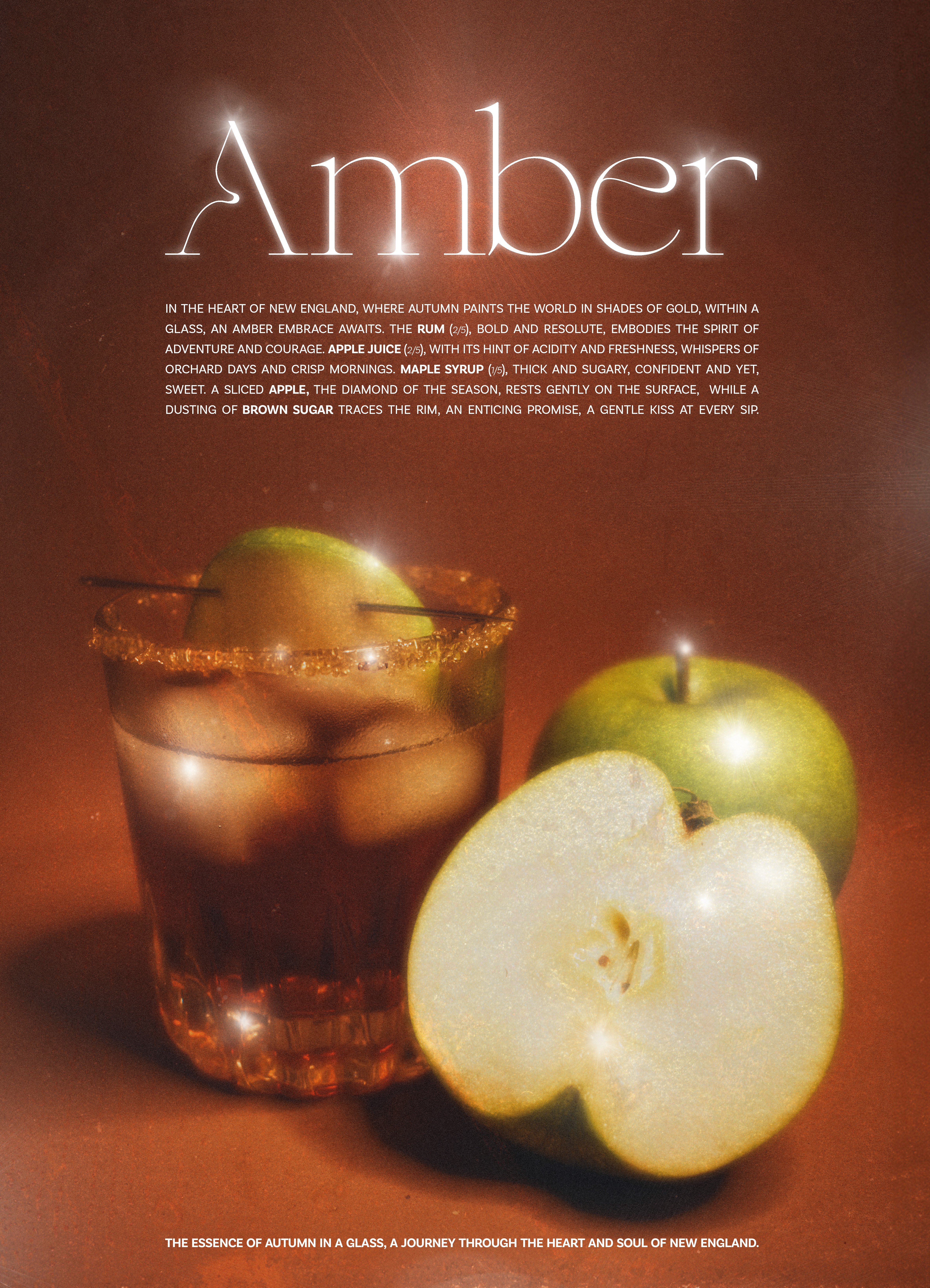

Some poster typography experiments:
Some poster typography experiments:
Spread love, it's the Brooklyn way!
Spread love, it's the Brooklyn way!
From observation to letterform, Brooklyn turns the visual identity of a neighborhood into a bold display typeface.